


The Project
Phorms Education SE, is a network of bilingual German-English schools and nurseries across Germany, operated by a German educational company, offering high-quality education from nursery to secondary level, with a unique pedagogical concept emphasizing individuality and language immersion.
The client desired a naming and a sub-branding design concept that retained elements of Phorms' branding while extending the visual language beyond their corporate identity, offering a fresh perspective yet maintaining a visual connection to the overarching Phorms brand. It should resonate with Phorms' identity while also diverging from conventional visual communication within the education sector. The in-house and nationwide campaign aimed to emotionally engage educators and teachers, inspiring them to explore and participate.
Our challenge was to build upon the established Phorms Education branding and explore new possibilities within it, while also introducing a new visual layer to create communication that stands out within the established conventional framework in the field of education.
My Role
In collaboration with the Phorms' Marketing team, I led the project's development for a global audience. As the primary designer, I held the responsibility of overseeing the entire process from inception to completion. My multifaceted role encompassed project management, pitching, art direction, and visuals.
For this project I've partner up and worked hand-in-hand with my beloved friend and former colleague Stefania Conchiglia, a seasoned Italian Senior Designer, who provided valuable assistance in conceiving the creative concept and executing the project.
Tools: Illustrator, Photoshop, Indesign, Acrobat, After Effects, Implementation of Handwritten Elements by Brush and Ink on Paper
Challenging Norms: Rearranging, Elevating and Unfolding

Naming
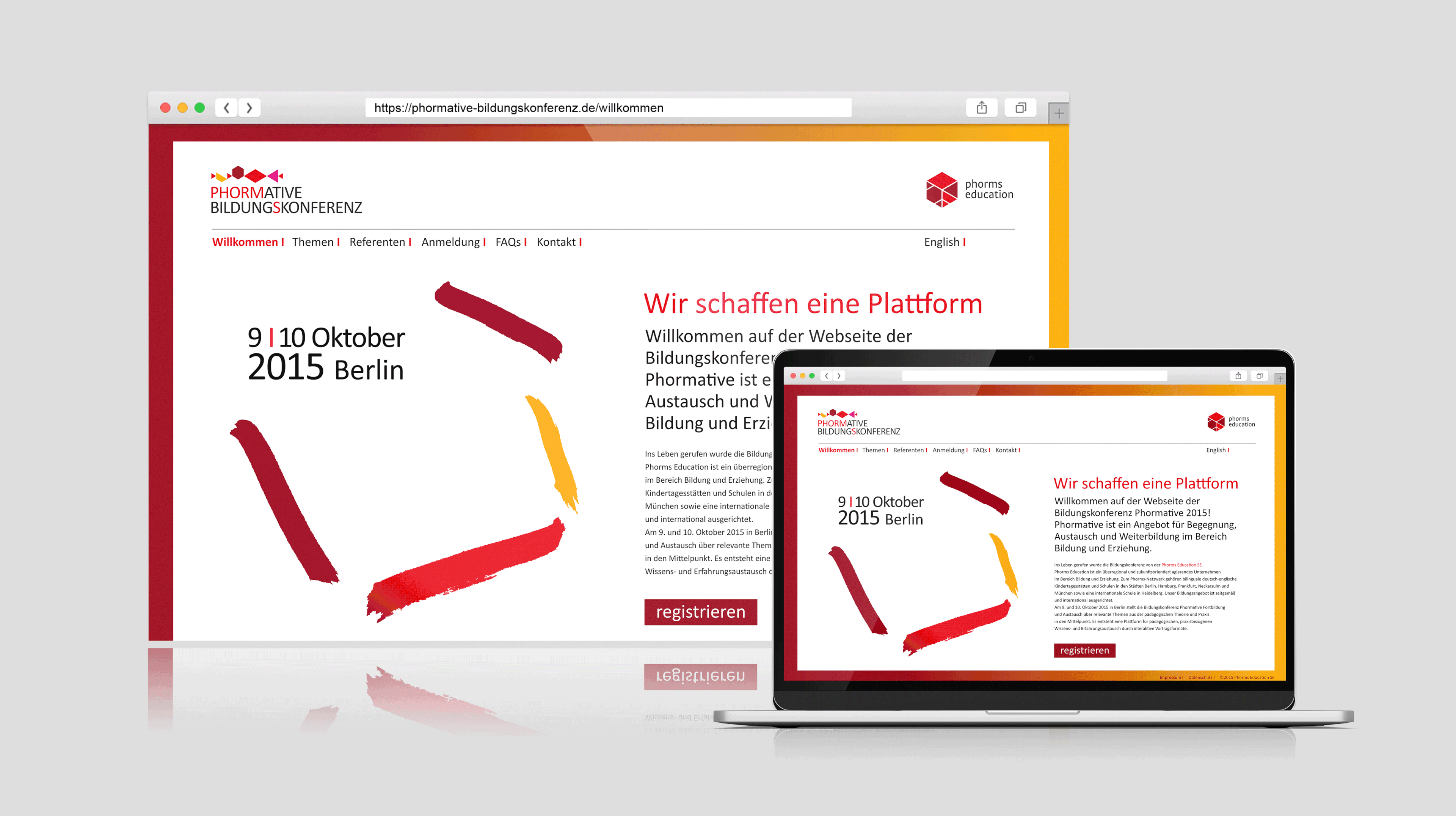
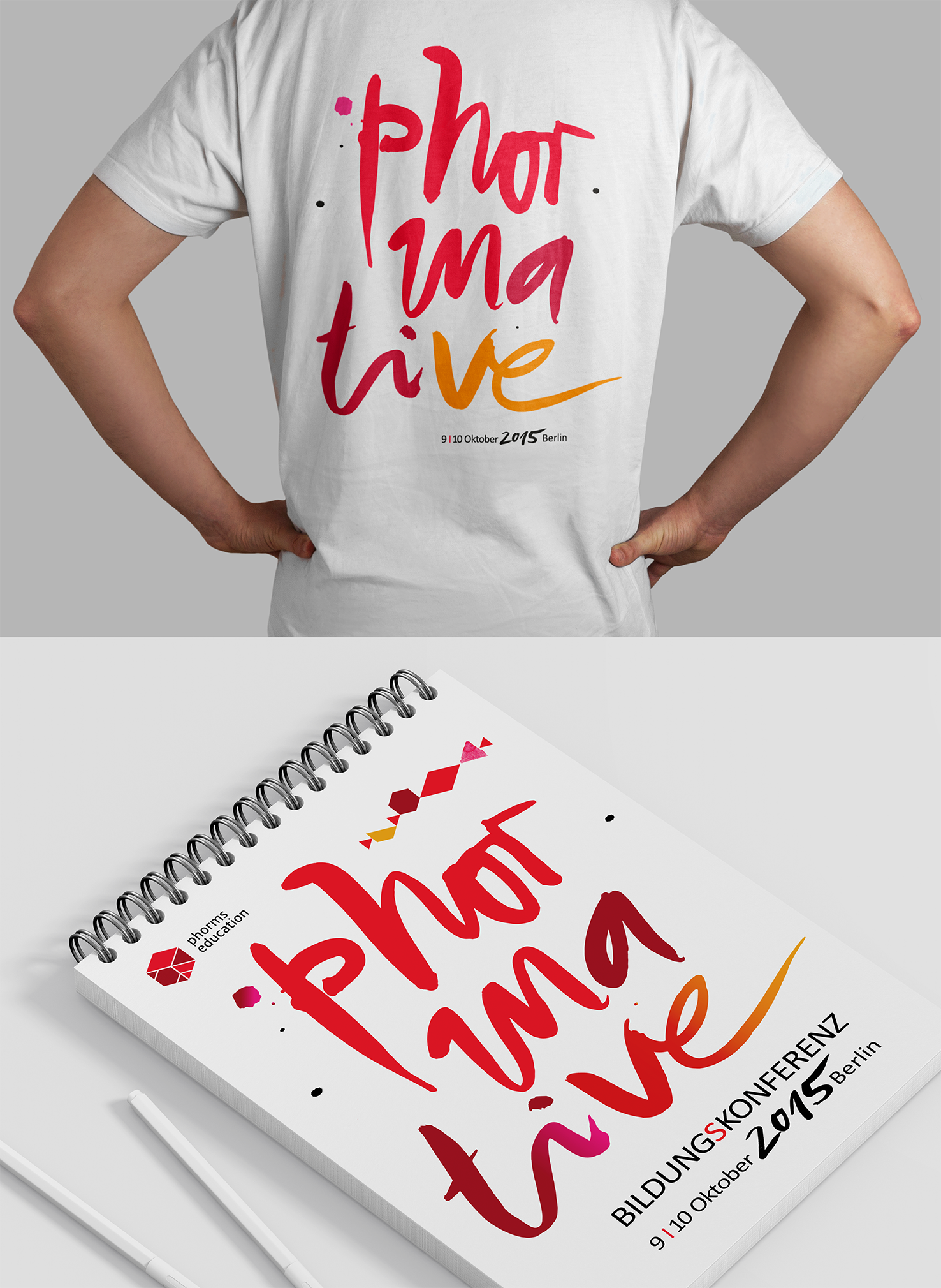
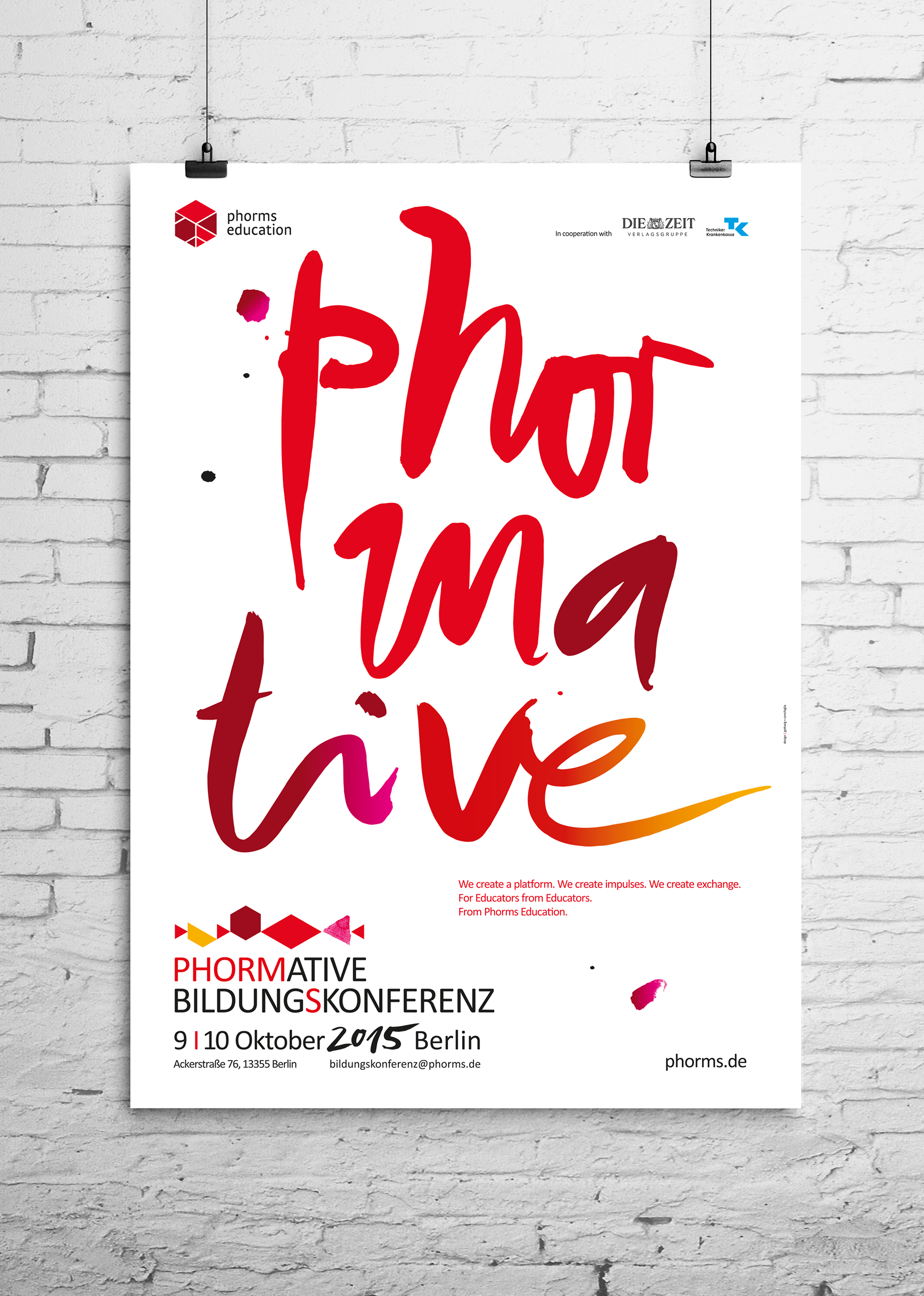
The name PHORMATIVE, derived from "formative," symbolized the event's educational role in the bilingual approach. It cleverly intertwined "Phorms" and "formative" into a single, engaging word, capturing the essence of the conference.

The goal was to reflect the conference's themes and to leverage Phorms' geometric Corporate Design, infusing it with new life by rearranging elements according to the conference topics. Throughout the design and campaign development process, we consistently conducted A/B tests with both the client and Phorms educators to pinpoint the most effective design direction.
Logo
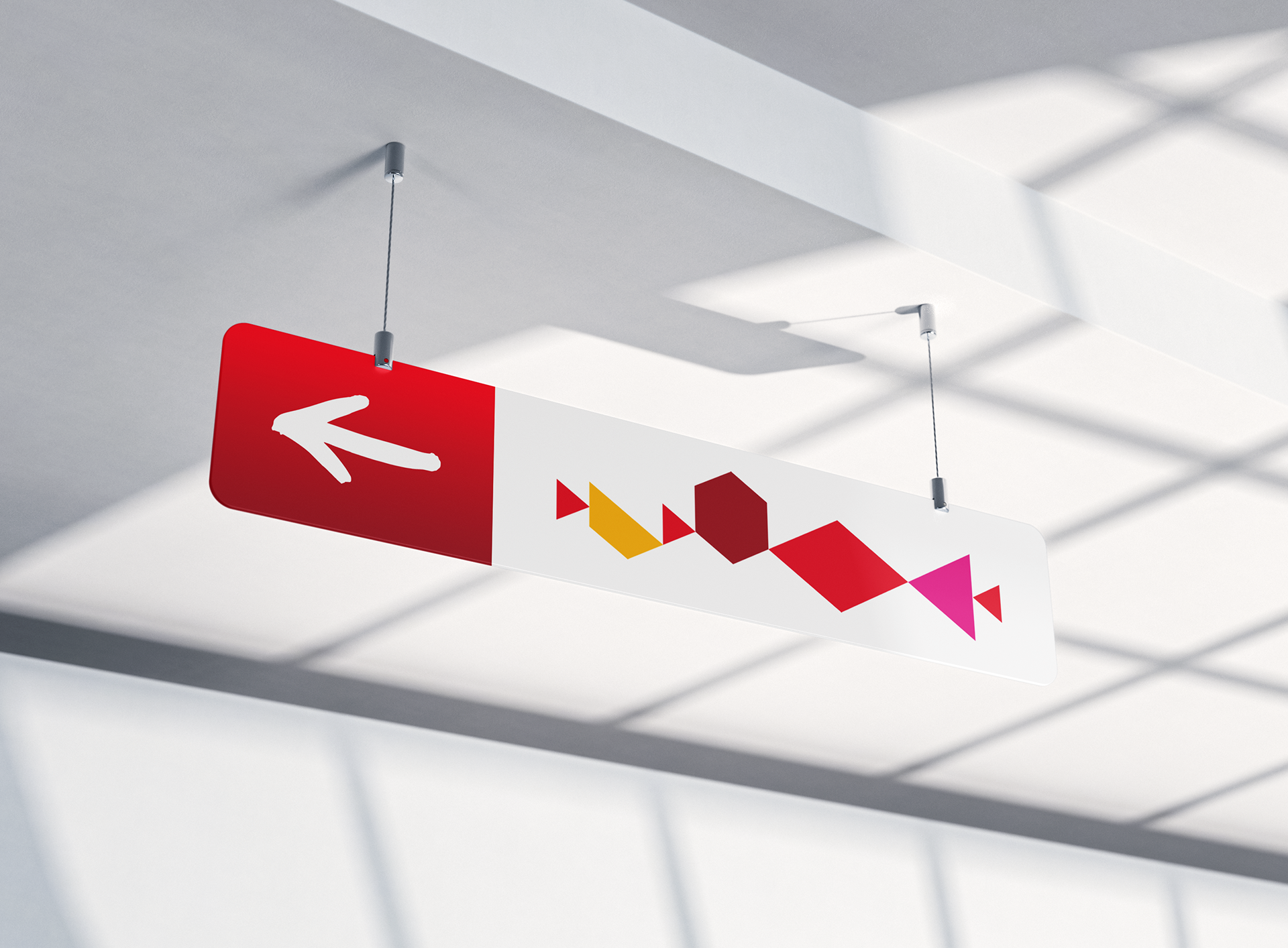
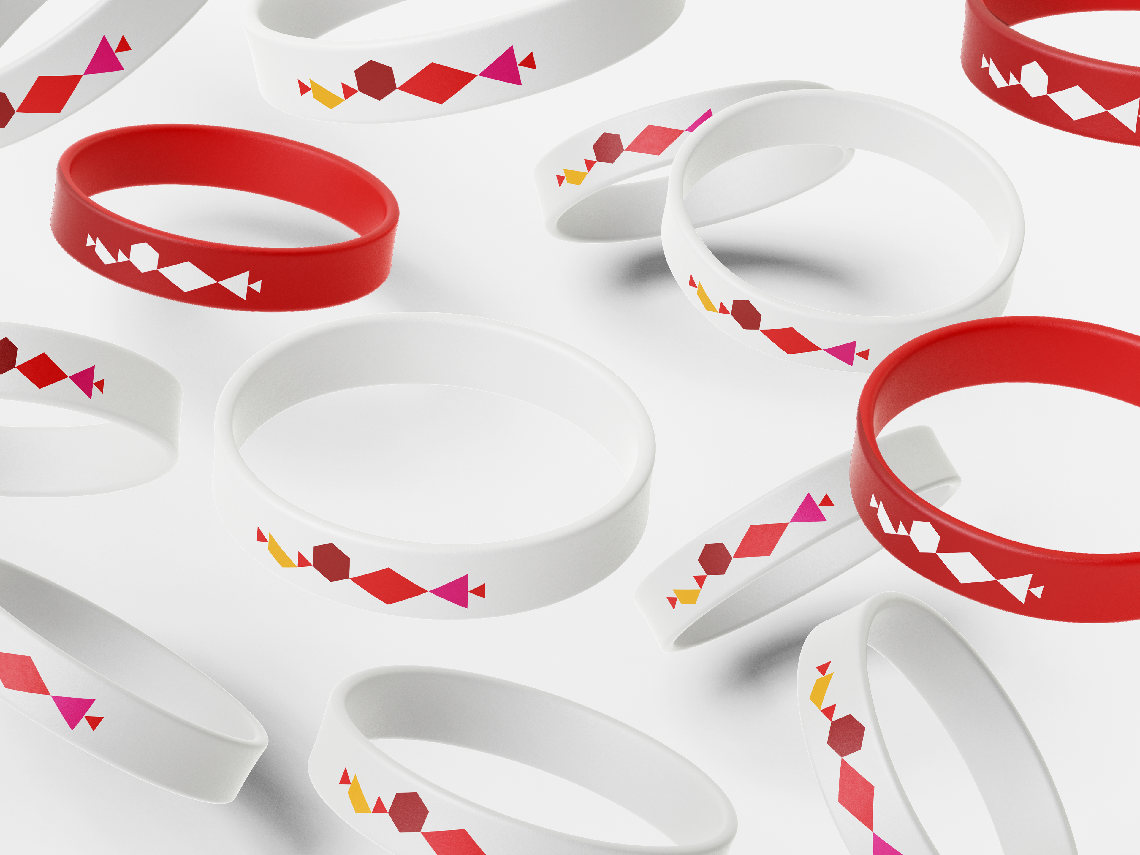
The Phorms logo was deconstructed in its components and rearranged into a new form, serving as a graphical representation of unfolding a space and the vibrant coexistence of individual diversity within the same spectrum of belonging.

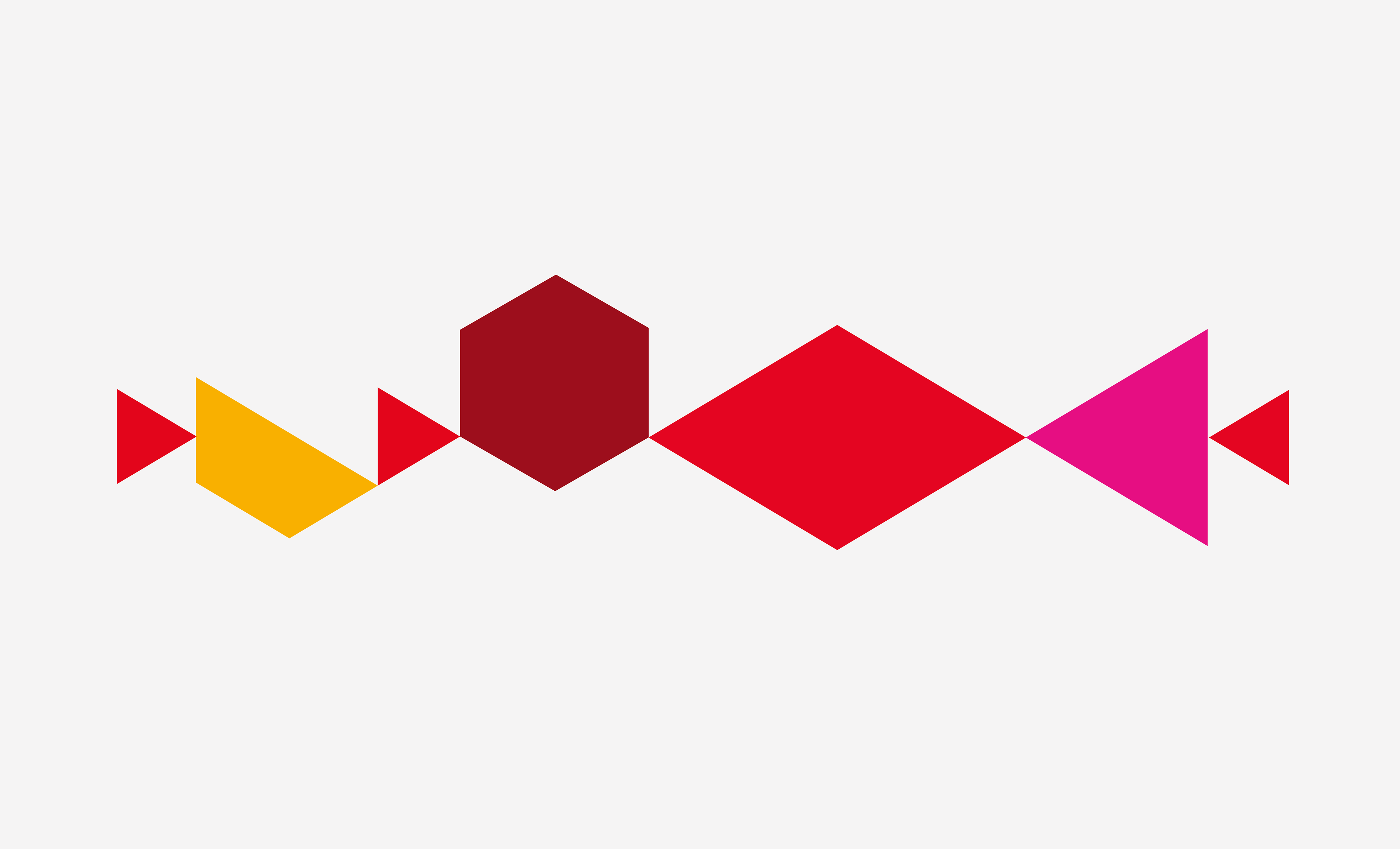


Color
The color palette harmonized with Phorms' corporate colors, augmented by warm yellow and trendy pink tones. Gradients added vibrancy and reinforced the dynamic feel.
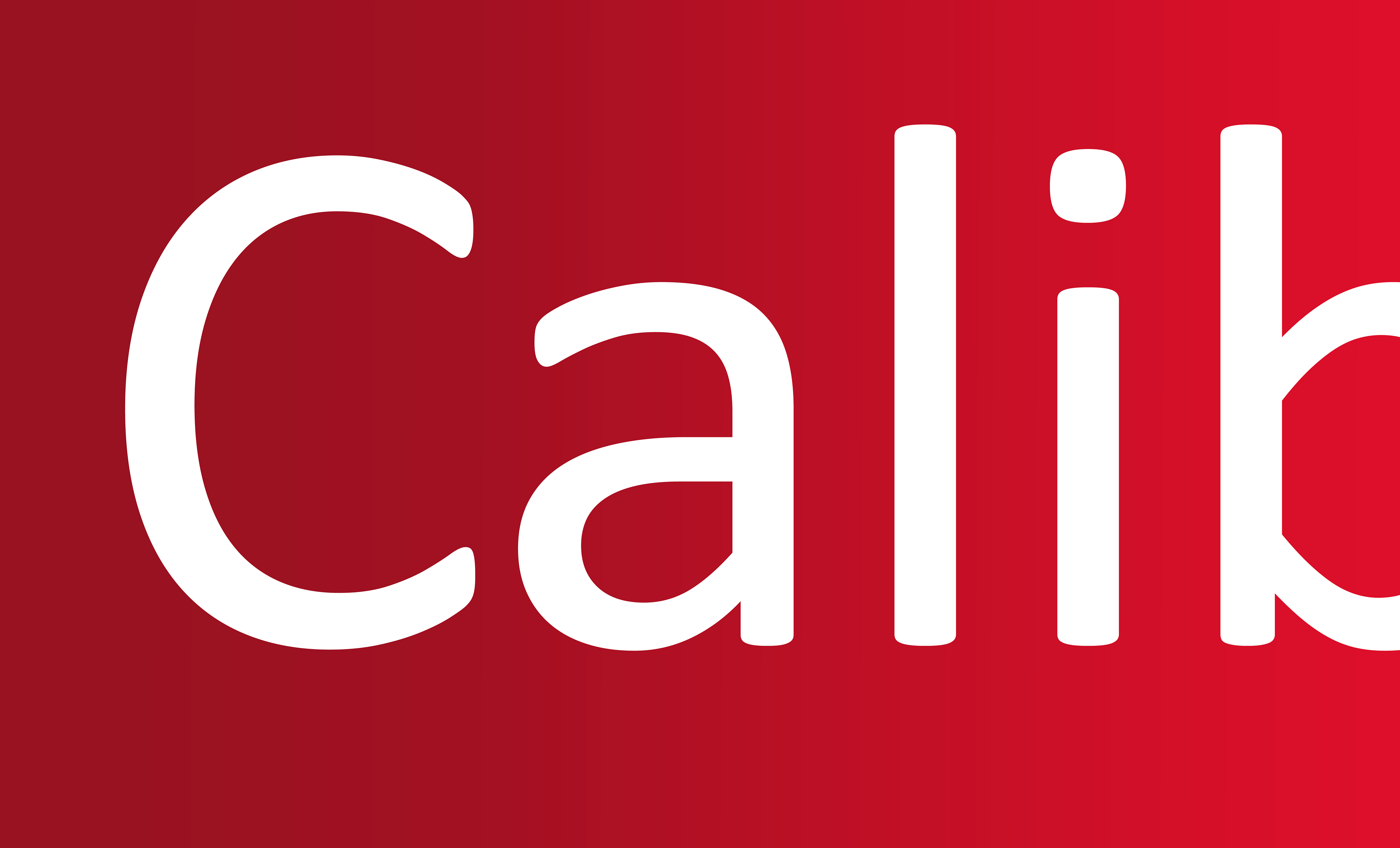


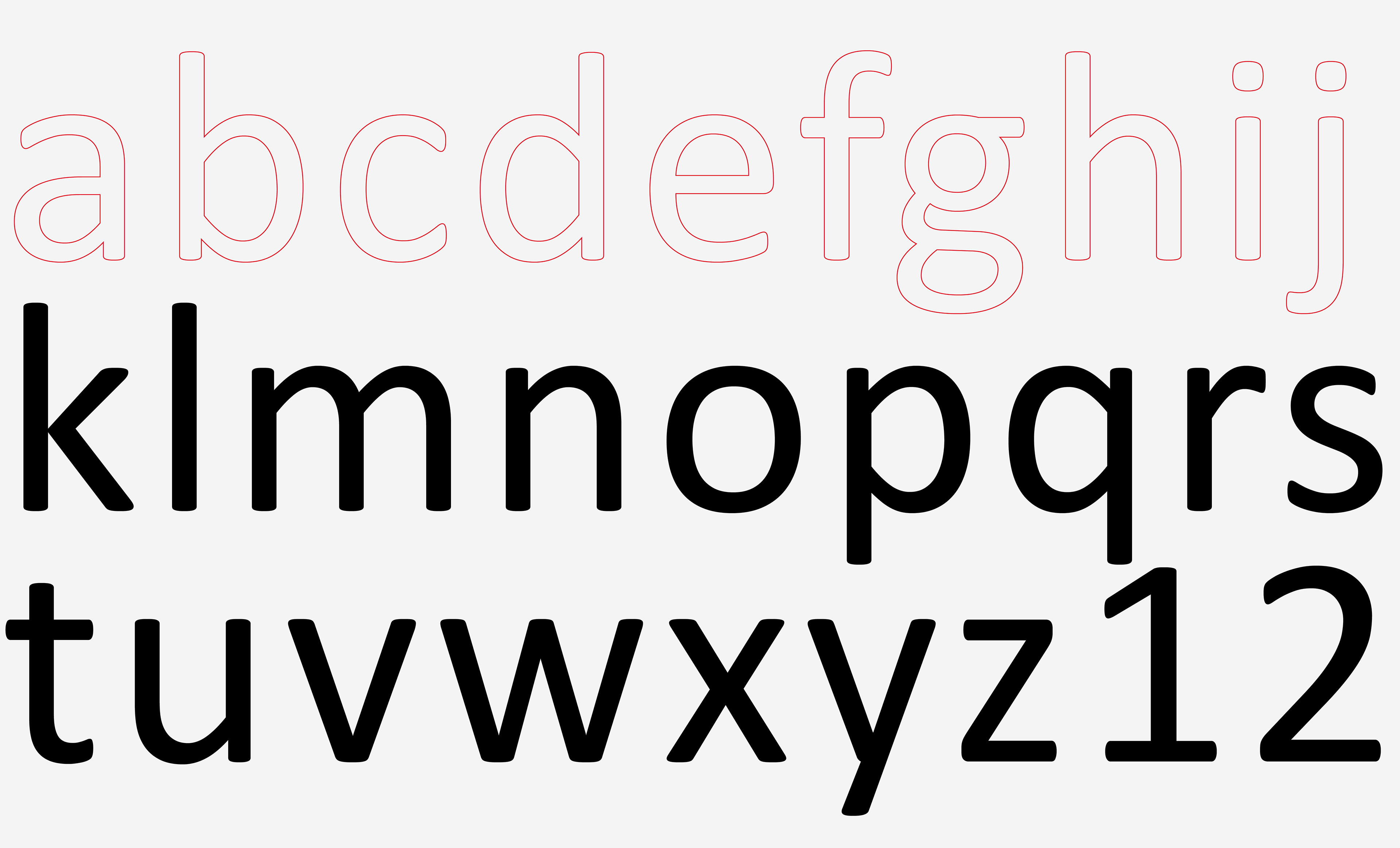
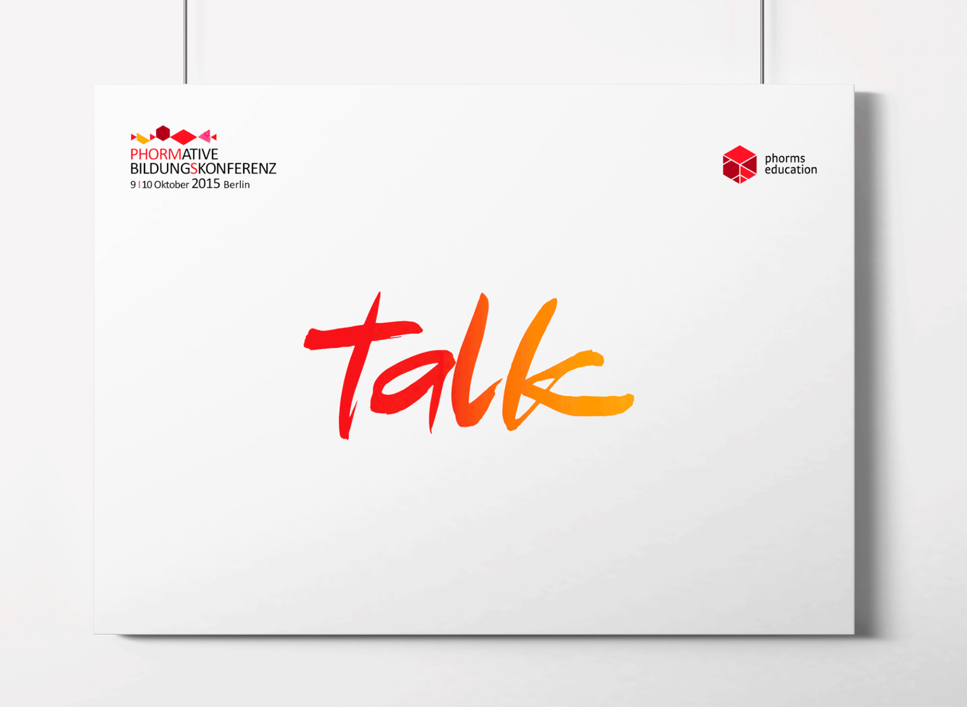
Typography & Calligraphy
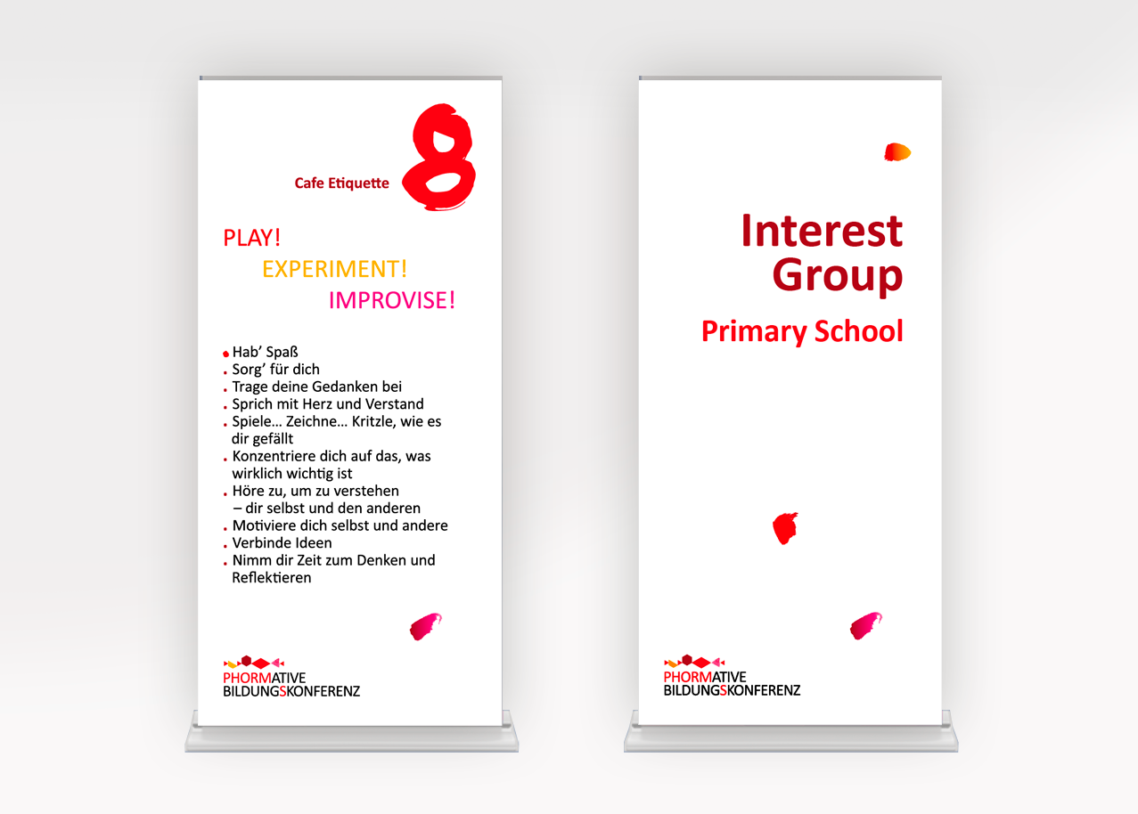
Typography played a significant role, combining digital Calibri Font with handcrafted calligraphy to create a distinctive and personalized touch throughout the branding elements.
Breaking the Static: Vibrant Emotional Abstracts for Advertising and Event
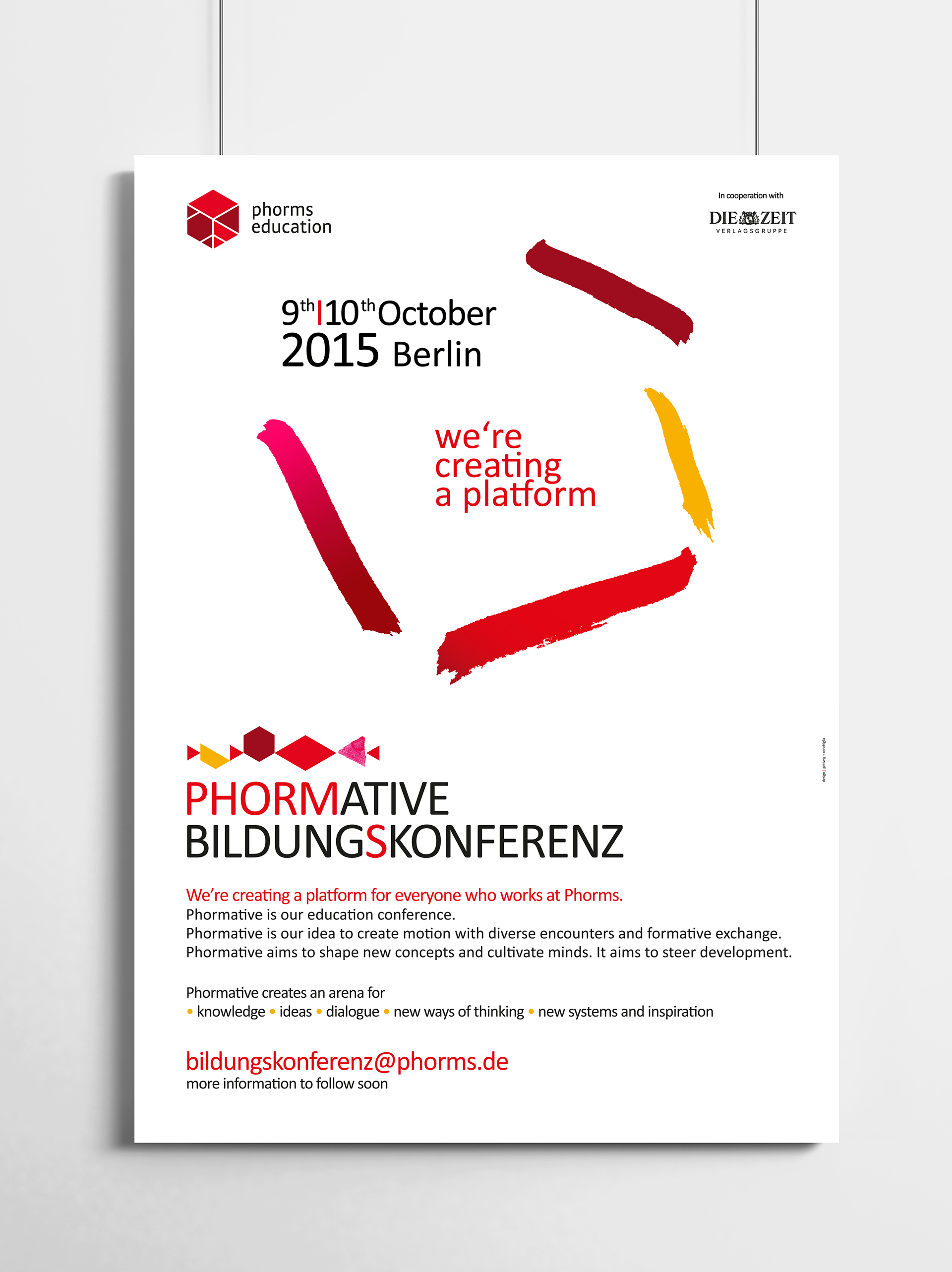
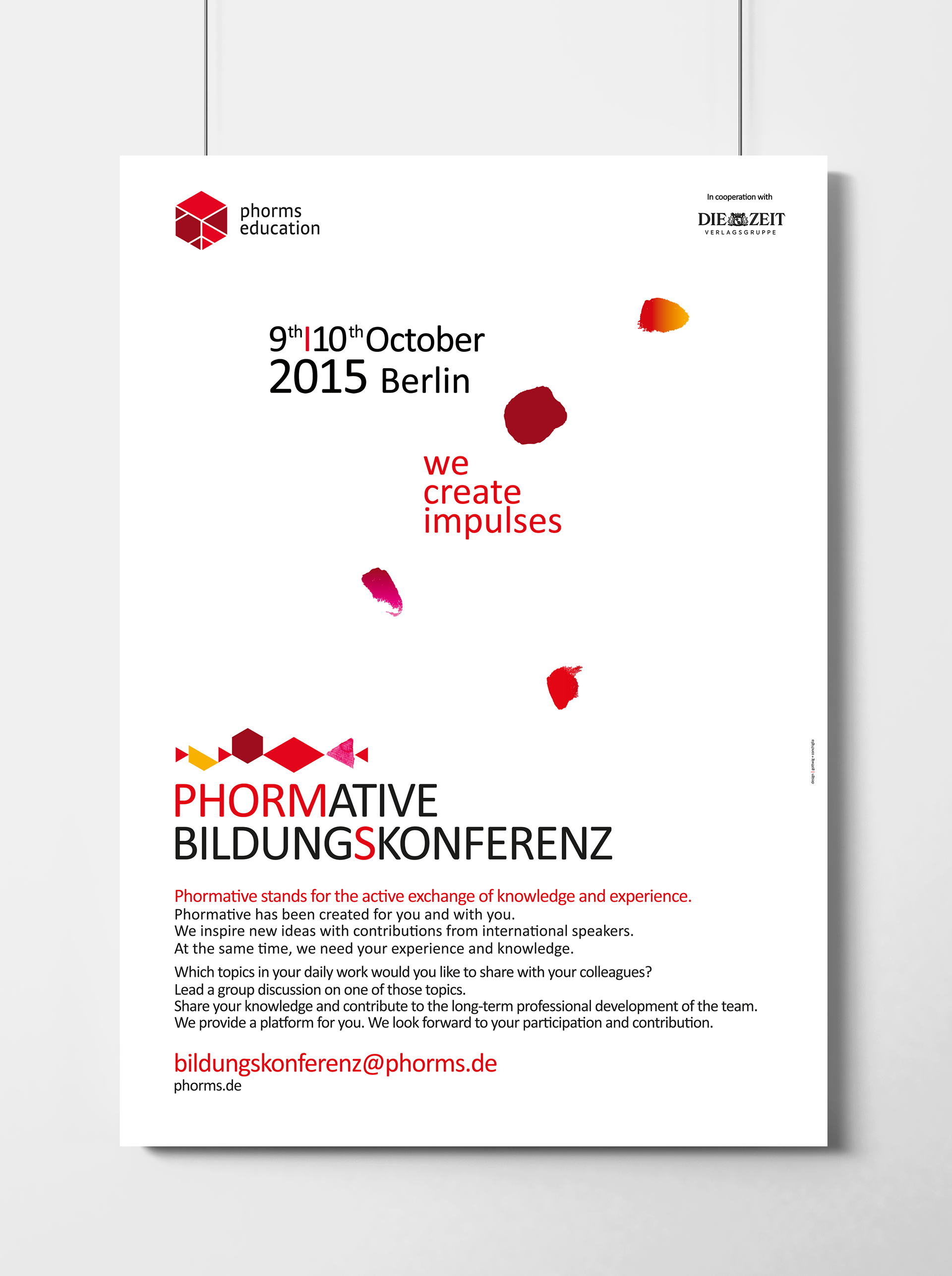
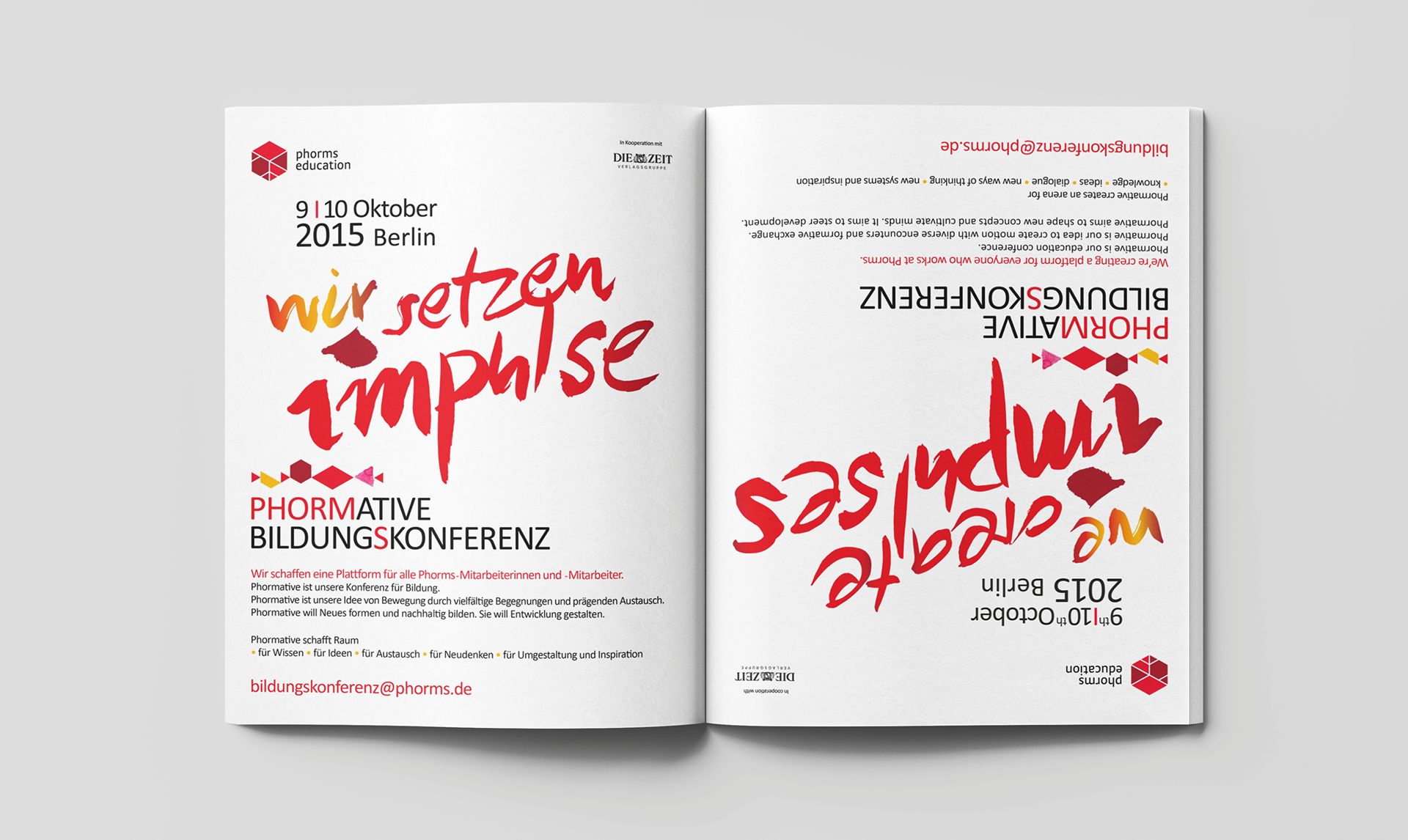

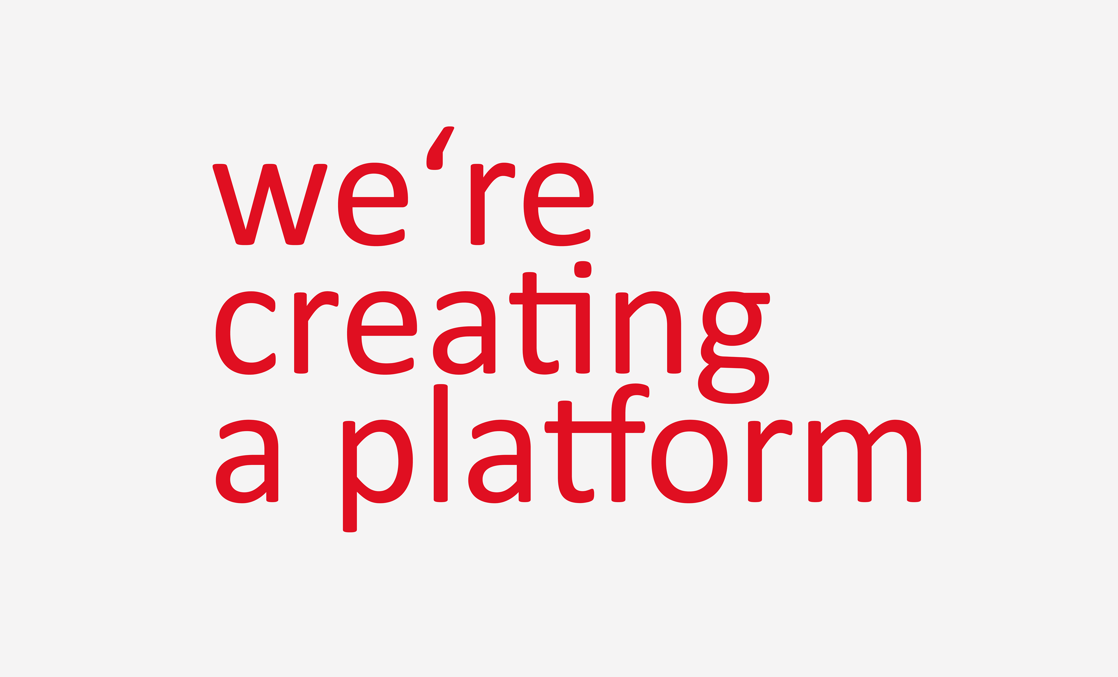
We infused emotion and movement into the design through a dynamic color palette, the incorporation of calligraphy, and the use of abstract illustrations. This added a human touch and contrasted well with the pre-established geometric Phorms Identity framework. The design concept is an emotional and dynamic visualization of the campaign's central theme and the event's vision of creating a space for vibrant inspiration and exchange.
The hand-drawn illustrations and calligraphic headings prominently stand out within the existing structures, enhancing the message in a visually distinct manner, creating a distinct separation from the informative content.
The hand-drawn visuals enriched the design, extending across all communication channels. They encompassed all communication, especially within the nationwide in-house and external campaign across both print and digital formats, as well as in the event's arrangement itself.
The resulting design not only echoed Phorms' identity but also broke away from conventional visual communication in the field of education.