ARTICA
Independent Project
Services: Creative Concept, Branding, Naming, Responsive Web App UI Design
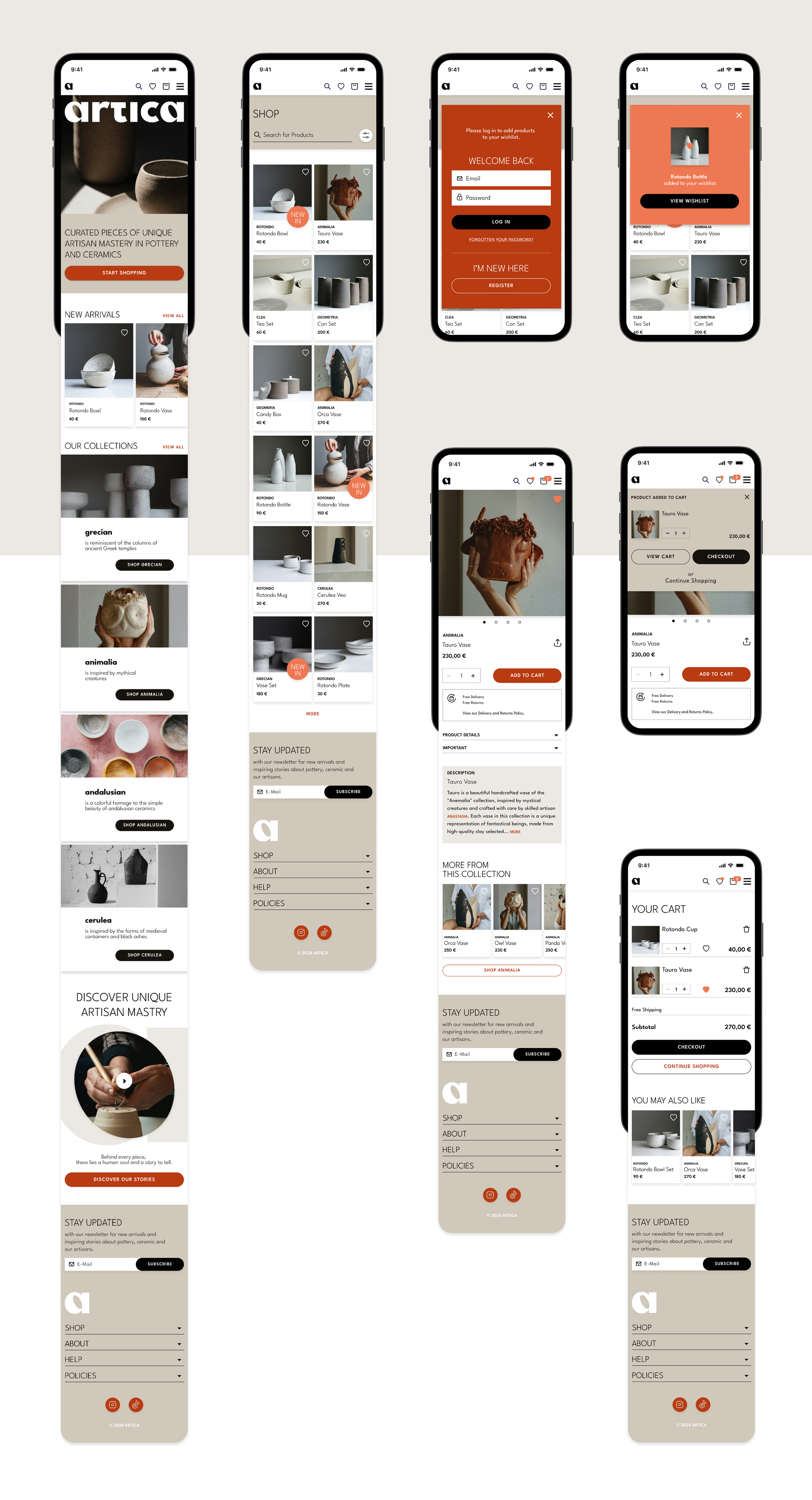
This independently developed project encompasses a comprehensive design process, spanning from brand conception to responsive user interface design. The goal was to create a distinctive, minimalist brand that embodies clarity, elegance, and purpose. From naming and identity to interface design and implementation, every element was crafted to support a seamless, intuitive e-commerce experience across all devices
My Role
I led the project end-to-end, applying creative direction across concept development, brand strategy, visual design, and user experience to deliver a cohesive and responsive e-commerce experience.
ARTICA is more than an online store: It's a tribute to the art of pottery and ceramics. Designed to immerse users in a calm, atmospheric, and minimalistic digital space, ARTICA blends storytelling with refined aesthetics to elevate the shopping experience. More than just a marketplace, ARTICA celebrates craftsmanship—highlighting the makers behind each piece and promoting appreciation for slow, intentional design.
The values of Artica are seamlessly translated into the visual design decisions, shaping the visual personality and the UI design of the brand.
Artica is minimal. Its design embraces simplicity, with clean lines and bold forms that highlight the beauty of each handmade piece. Artica is elegant. A clear, atmospheric layout and refined visuals create a seamless, graceful shopping experience. Artica is artisan. Every item reflects the expertise of skilled makers, celebrating craftsmanship and timeless artistry. Artica is natural. Earthy tones and organic imagery capture the harmony and essence of pottery and ceramics.
Visual Direction
The wordmark is bold and minimal, with rounded curves inspired by pottery. The standalone “A” works as an abstract vessel and versatile brand mark. Typography is modern and balanced, combining clarity with elegance.
Colors draw from clay and terracotta, with white as a clean canvas. Imagery captures light, atmosphere, and human touch—showcasing objects as treasures.


